12个CSS动画效果!!附源码
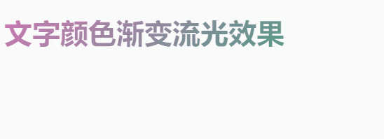
1.文字颜色渐变流光效果:
效果图:
代码:
<!DOCTYPE html><html><head><meta charset="UTF-8"><title></title><style>/* 加上 -webkit- 注意兼容 */h1 {background: -webkit-linear-gradient(135deg,#0eaf6d,#ff6ac6 25%,#147b96 50%,#e6d205 55%,#2cc4e0 60%,#8b2ce0 80%,#ff6384 95%,#08dfb4);/* 文字颜色填充设置为透明 */-webkit-text-fill-color: transparent;/* 背景裁剪,即让文字使用背景色 */-webkit-background-clip: text;/* 背景图放大一下,看着柔和一些 */-webkit-background-size: 200% 100%;/* 应用动画flowCss 12秒速度 无限循环 线性匀速动画*/-webkit-animation: flowCss 12s infinite linear;}@-webkit-keyframes flowCss {0% {/* 移动背景位置 */background-position: 0 0;}100% {background-position: -400% 0;}}h1:hover {-webkit-animation: flowCss 4s infinite linear;}</style></head><body><h1>文字颜色渐变流光效果</h1><!-- 思路就是 文字颜色填充为透明、背景裁剪让文字使用背景色、然后设置一个渐变背景色再放大一下背景,最后通过动画移动背景位置,于是效果就出来了 --></body></html>
2.文字左右旋转晃动效果:
效果图:
代码:
<!DOCTYPE html><html lang="en"><head><meta charset="UTF-8"><meta http-equiv="X-UA-Compatible" content="IE=edge"><meta name="viewport" content="width=device-width, initial-scale=1.0"><title>Document</title><style>span {font-size: 48px;font-weight: 600;animation: rotate 0.3s ease infinite;/* 注意,要开启绝对定位哦 */position: absolute;}/* 鼠标悬浮开启动画也可以的span:hover {animation: rotate 0.3s ease infinite;} */@keyframes rotate {0% {transform: rotate(0);}20% {transform: rotate(-2deg);}60% {transform: rotate(0);}80% {transform: rotate(2deg);}100% {transform: rotate(0);}}span:nth-child(2) {margin-left: 108px;}span:nth-child(3) {margin-left: 216px;}</style></head><body><span>小黑</span><span>小黑</span><span>小黑</span></body></html>
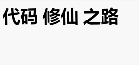
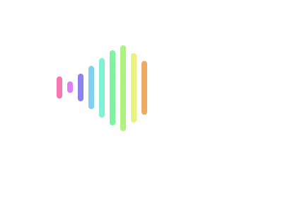
3.音频波纹加载效果:
效果图:
代码:
<!DOCTYPE html><html lang="en"><head><meta charset="UTF-8"><meta http-equiv="X-UA-Compatible" content="IE=edge"><meta name="viewport" content="width=device-width, initial-scale=1.0"><title>Document</title><style>body {padding: 120px;}.music {width: 175px;height: 100px;display: flex;}.music span {width: 6px;border-radius: 18px;margin-right: 6px;}.music span:nth-child(1) {/* 时间递增,参差不齐的效果 */animation: bar1 2s 0.2s infinite linear;}.music span:nth-child(2) {animation: bar2 2s 0.4s infinite linear;}.music span:nth-child(3) {animation: bar3 2s 0.6s infinite linear;}.music span:nth-child(4) {animation: bar4 2s 0.8s infinite linear;}.music span:nth-child(5) {animation: bar5 2s 1.0s infinite linear;}.music span:nth-child(6) {animation: bar6 2s 1.2s infinite linear;}.music span:nth-child(7) {animation: bar7 2s 1.4s infinite linear;}.music span:nth-child(8) {animation: bar8 2s 1.6s infinite linear;}.music span:nth-child(9) {animation: bar9 2s 1.8s infinite linear;}@keyframes bar1 {0% {background: #f677b0;margin-top: 25%;height: 10%;}50% {background: #f677b0;height: 100%;margin-top: 0%;}100% {background: #f677b0;height: 10%;margin-top: 25%;}}@keyframes bar2 {0% {background: #df7ff2;margin-top: 25%;height: 10%;}50% {background: #df7ff2;height: 100%;margin-top: 0%;}100% {background: #df7ff2;height: 10%;margin-top: 25%;}}@keyframes bar3 {0% {background: #8c7ff2;margin-top: 25%;height: 10%;}50% {background: #8c7ff2;height: 100%;margin-top: 0%;}100% {background: #8c7ff2;height: 10%;margin-top: 25%;}}@keyframes bar4 {0% {background: #7fd0f2;margin-top: 25%;height: 10%;}50% {background: #7fd0f2;height: 100%;margin-top: 0%;}100% {background: #7fd0f2;height: 10%;margin-top: 25%;}}@keyframes bar5 {0% {background: #7ff2d3;margin-top: 25%;height: 10%;}50% {background: #7ff2d3;height: 100%;margin-top: 0%;}100% {background: #7ff2d3;height: 10%;margin-top: 25%;}}@keyframes bar6 {0% {background: #7ff2a0;margin-top: 25%;height: 10%;}50% {background: #7ff2a0;height: 100%;margin-top: 0%;}100% {background: #7ff2a0;height: 10%;margin-top: 25%;}}@keyframes bar7 {0% {background: #adf27f;margin-top: 25%;height: 10%;}50% {background: #adf27f;height: 100%;margin-top: 0%;}100% {background: #adf27f;height: 10%;margin-top: 25%;}}@keyframes bar8 {0% {background: #e7f27f;margin-top: 25%;height: 10%;}50% {background: #e7f27f;height: 100%;margin-top: 0%;}100% {background: #e7f27f;height: 10%;margin-top: 25%;}}@keyframes bar9 {0% {background: #ecaa64;margin-top: 25%;height: 10%;}50% {background: #ecaa64;height: 100%;margin-top: 0%;}100% {background: #ecaa64;height: 10%;margin-top: 25%;}}</style></head><body><div class="music"><span></span><span></span><span></span><span></span><span></span><span></span><span></span><span></span><span></span></div><!-- 给每一个bar指定margin-top和height的动画的变化为了效果更好看,让每一个bar的背景色都不一样,便是五彩斑斓了 --></body></html>
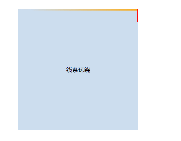
代码:
<!DOCTYPE html><html lang="en"><head><meta charset="UTF-8"><meta http-equiv="X-UA-Compatible" content="IE=edge"><meta name="viewport" content="width=device-width, initial-scale=1.0"><title>Document</title><style>body {padding: 120px;}.mainbox {width: 320px;height: 320px;position: relative;/* 超出隐藏需要加上 */overflow: hidden;}.content {width: 320px;height: 320px;line-height: 320px;text-align: center;background-color: #cde;}.line {/* 结合外层元素的相对定位 */position: absolute;}.line:nth-child(1) {top: 0;left: 0;width: 100%;height: 3px;/* 加上渐变效果,方可形成拖尾效果 */background: linear-gradient(90deg, transparent, orange);animation: animate1 8s linear infinite;}/* 分别控制其上下左右的定位距离,从而形成线条跟随效果 */@keyframes animate1 {0% {left: -100%;}50%,100% {left: 100%;}}.line:nth-child(2) {top: -100%;right: 0;width: 3px;height: 100%;background: linear-gradient(180deg, transparent, red);animation: animate2 8s linear infinite;/* 注意要加上延时触发动画效果,这样线条才会依次触发 */animation-delay: 2s;}@keyframes animate2 {0% {top: -100%;}50%,100% {top: 100%;}}.line:nth-child(3) {bottom: 0;right: 0;width: 100%;background: linear-gradient(270deg, transparent, green);animation: animate3 8s linear infinite;animation-delay: 4s;}@keyframes animate3 {0% {right: -100%;height: 3px;}50%,100% {height: 2px;right: 100%;}}.line:nth-child(4) {bottom: -100%;left: 0;width: 3px;height: 100%;background: linear-gradient(360deg, transparent, #3a86ff);animation: animate4 8s linear infinite;animation-delay: 6s;}@keyframes animate4 {0% {bottom: -100%;}50%,100% {bottom: 100%;}}</style></head><body><div class="mainbox"><span class="line"></span><span class="line"></span><span class="line"></span><span class="line"></span><div class="content">线条环绕</div></div></body></html>
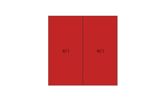
代码:
<!DOCTYPE html><html lang="en"><head><meta charset="UTF-8"><meta http-equiv="X-UA-Compatible" content="IE=edge"><meta name="viewport" content="width=device-width, initial-scale=1.0"><title>Document</title><style>body {box-sizing: border-box;padding: 160px 0 0 240px;}/* 门容器样式 */.doorWrap {width: 320px;height: 320px;border: 1px solid #666;perspective: 500px;position: relative;display: flex;}/* 左门右门的共有样式 */.leftDoor,.rightDoor {width: 50%;height: 100%;background-color: rgb(194, 37, 37);transition: 1.2s;z-index: 2;display: flex;justify-content: center;align-items: center;border: 1px solid #333;}/* 设置旋转元素的基点,左边大门以左侧为基准点旋转 */.leftDoor {transform-origin: left;}/* 设置旋转元素的基点,右边大门以右侧为基准点旋转 */.rightDoor {transform-origin: right;}/* 当鼠标悬浮的时候,设置开门的幅度,左门往左侧开 */.doorWrap:hover .leftDoor {transform: rotateY(-130deg);}/* 右门往右侧开 */.doorWrap:hover .rightDoor {transform: rotateY(130deg);}/* 内容区的定位层级稍微低一些 */.content {position: absolute;z-index: 1;width: 100%;height: 100%;background-color: #abf;display: flex;justify-content: center;align-items: center;}</style></head><body><div class="doorWrap"><div class="leftDoor">左门</div><div class="rightDoor">右门</div><div class="content">欢迎光临,客官里边请...</div></div></body></html>
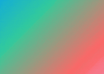
代码:
<!DOCTYPE html><html lang="en"><head><meta charset="UTF-8"><meta http-equiv="X-UA-Compatible" content="IE=edge"><meta name="viewport" content="width=device-width, initial-scale=1.0"><title>Document</title><style>.bg {margin: 60px;width: 32%;height: 48vh;background: linear-gradient(-45deg, #dae, #f66, #3c9, #09f, #66f);background-size: 200% 200%;animation: gradient 8s ease infinite;}@keyframes gradient {0% {background-position: 0 12%;}50% {background-position: 100% 100%;}100% {background-position: 0 12%;}}</style></head><body><div class="bg"></div></body></html>
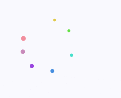
代码:
<!DOCTYPE html><html lang="en"><head><meta charset="UTF-8"><meta name="viewport" content="width=device-width, initial-scale=1.0"><meta http-equiv="X-UA-Compatible" content="ie=edge"><title>Document</title><style>.wrap {margin: 120px 0 0 240px;width: 75px;height: 75px;position: relative;/* transform-origin: 设置的效果搭配边框看,效果更加明显 *//* border: 1px solid #e9e9e9; */}.round {position: absolute;width: 13px;height: 13px;border-radius: 50%;background-color: rgb(241, 141, 157);/* 加上动画效果 */animation: circleRound 2.8s ease infinite;/* 设置旋转中心,搭配.wrap的border看 */transform-origin: 50% 75px;}/* 注意z-index层级关系,依次递减 */.round:nth-child(1) {z-index: 7;}/* 注意动画延后animation-delay播放,依次递增 *//* 至于小圆球则越来越小 */.round:nth-child(2) {height: 12px;width: 12px;background-color: rgb(199, 136, 185);animation-delay: .2s;z-index: 6;}.round:nth-child(3) {height: 11px;width: 11px;background-color: rgb(153, 69, 223);animation-delay: .4s;z-index: 5;}.round:nth-child(4) {height: 10px;width: 10px;background-color: rgb(69, 141, 223);animation-delay: .6s;z-index: 4;}.round:nth-child(5) {height: 9px;width: 9px;background-color: rgb(69, 223, 203);animation-delay: .8s;z-index: 3;}.round:nth-child(6) {height: 8px;width: 8px;background-color: rgb(100, 223, 69);animation-delay: 1s;z-index: 2;}.round:nth-child(7) {height: 7px;width: 7px;background-color: rgb(223, 200, 69);animation-delay: 1.2s;z-index: 1;}@keyframes circleRound {to {transform: rotate(1turn);}}</style></head><body><div class="wrap"><div class="round"></div><div class="round"></div><div class="round"></div><div class="round"></div><div class="round"></div><div class="round"></div><div class="round"></div></div></body></html>

代码:
<!DOCTYPE html><html lang="en"><head><meta charset="UTF-8"><meta http-equiv="X-UA-Compatible" content="IE=edge"><meta name="viewport" content="width=device-width, initial-scale=1.0"><title>Document</title><style>/* 主要是text-shadow和transform搭配动画的巧妙运用 */.wrap {width: 600px;height: 480px;box-sizing: border-box;padding: 120px;background-color: #000;color: transparent;display: flex;}h3 {text-shadow: 0 0 0 #fff;animation: smoky 6s infinite;}@keyframes smoky {60% {text-shadow: 0 0 40px #fff;}100% {text-shadow: 0 0 20px #fff;/* 这里是重点 */transform: translate3d(15rem, -8rem, 0) rotate(-40deg) skew(70deg) scale(1.5);opacity: 0;}}h3:nth-child(1) {animation-delay: 1s;}h3:nth-child(2) {animation-delay: 1.4s;}h3:nth-child(3) {animation-delay: 1.8s;}h3:nth-child(4) {animation-delay: 2.2s;}h3:nth-child(5) {animation-delay: 2.6s;}</style></head><body><div class="wrap"><h3>代码</h3><h3>修仙</h3><h3>之路</h3><h3>道阻</h3><h3>且长...</h3></div></body></html>
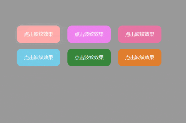
代码:
<!DOCTYPE html><html lang="en"><head><meta charset="UTF-8"><meta http-equiv="X-UA-Compatible" content="IE=edge"><meta name="viewport" content="width=device-width, initial-scale=1.0"><title>Document</title><style>body {padding: 120px;background-color: #999;}button {margin: 8px;width: 120px;height: 48px;background-color: #faa;color: #fff;border: none;border-radius: 12px;cursor: pointer;/* 开启定位是为了给波纹动画元素使用 */position: relative;/* 必须加上超出隐藏,注释掉以后效果很明显 */overflow: hidden;/* hover过渡一下 */transition: all 0.3s;}button:hover {box-shadow: 0 0 18px rgba(255, 255, 255, 0.36);}.btn2 {background-color: violet;}.btn3 {background-color: rgb(231, 116, 164);}.btn4 {background-color: rgb(116, 204, 231);}.btn5 {background-color: rgb(54, 134, 58);}.btn6 {background-color: rgb(224, 126, 45);}.ripple {position: absolute;border-radius: 50%;background-color: rgba(255, 255, 255, 0.48);transform: scale(0);animation: ripple 240ms linear;}@keyframes ripple {to {transform: scale(2.4);opacity: 0.12;}}</style></head><body><button class="targetBtn">点击波纹效果</button><button class="targetBtn btn2">点击波纹效果</button><button class="targetBtn btn3">点击波纹效果</button><button class="targetBtn btn4">点击波纹效果</button><button class="targetBtn btn5">点击波纹效果</button><button class="targetBtn btn6">点击波纹效果</button><script>// 创建波纹函数,只要一点击就创建一个波纹function createRipple(event) {const button = event.target; // 获取事件对象button按钮const circle = document.createElement("div"); // 创建一个div标签用于表示一个波纹(波纹就是一个圆)const diameter = Math.max(button.clientWidth, button.clientHeight); // 取dom宽度和高度中的一个最大值,以最大值做直径const radius = diameter / 2; // 直径除以2即为半径 (若不理解这几行,可注释掉overflow: hidden;再点击按钮即明白)circle.style.width = circle.style.height = `${diameter}px`; // 以直径作为宽高circle.style.left = `${event.clientX - button.offsetLeft - radius}px`; // 设置定位的位置circle.style.top = `${event.clientY - button.offsetTop - radius}px`;circle.classList.add("ripple"); // classList加上类名既有动画效果了// 若有这个波纹动画圆dom以后,就移除这个dom再追加。若没有直接追加let ripple = button.querySelector('.ripple')if (ripple) {ripple.remove();}button.appendChild(circle); // 将这个波纹动画圆作为子元素追加到父元素button上(这样父元素相对定位,子元素绝对定位就生效了)}// 1. 获取将要点击的按钮dom数组const targetBtnArr = document.querySelectorAll('.targetBtn')// 2. 给数组中的每一项,即要点击的按钮dom绑定点击监听事件for (let i = 0; i < targetBtnArr.length; i++) {let targetBtn = targetBtnArr[i]targetBtn.addEventListener("click", createRipple);}</script></body></html>
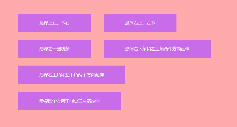
代码:
<!DOCTYPE html><html lang="en"><head><meta charset="UTF-8"><meta http-equiv="X-UA-Compatible" content="IE=edge"><meta name="viewport" content="width=device-width, initial-scale=1.0"><title>Document</title><style>body {background: #faa;padding: 120px;}button {display: inline-block;border: none;color: #fff;cursor: pointer;margin: 12px 18px;background: rgb(201, 108, 234);position: relative;}span {display: block;padding: 18px 60px}button::before,button::after {content: "";width: 0;height: 2px;position: absolute;transition: all .2s linear;background: #fff}span::before,span::after {content: "";width: 2px;height: 0;position: absolute;transition: all .2s linear;background: #fff}button:hover::before,button:hover::after {width: 100%}button:hover span::before,button:hover span::after {height: 100%}.btn1::before,.btn1::after {transition-delay: .2s}.btn1 span::before,.btn1 span::after {transition-delay: 0s}.btn1::before {right: 0;top: 0}.btn1::after {left: 0;bottom: 0}.btn1 span::before {left: 0;top: 0}.btn1 span::after {right: 0;bottom: 0}.btn1:hover::before,.btn1:hover::after {transition-delay: 0s}.btn1:hover span::before,.btn1:hover span::after {transition-delay: .2s}.btn2::before,.btn2::after {transition-delay: 0s}.btn2 span::before,.btn2 span::after {transition-delay: .2s}.btn2::before {right: 0;top: 0}.btn2::after {left: 0;bottom: 0}.btn2 span::before {left: 0;top: 0}.btn2 span::after {right: 0;bottom: 0}.btn2:hover::before,.btn2:hover::after {transition-delay: .2s}.btn2:hover span::before,.btn2:hover span::after {transition-delay: 0s}.btn3::after {left: 0;bottom: 0;transition-delay: .6s}.btn3 span::after {transition-delay: .4s;right: 0;bottom: 0}.btn3::before {right: 0;top: 0;transition-delay: .2s}.btn3 span::before {transition-delay: 0s;left: 0;top: 0}.btn3:hover::after {transition-delay: 0s}.btn3:hover span::after {transition-delay: .2s}.btn3:hover::before {transition-delay: .4s}.btn3:hover span::before {transition-delay: .6s}.btn4::after {right: 0;bottom: 0;transition-duration: .4s}.btn4 span::after {right: 0;bottom: 0;transition-duration: .4s}.btn4::before {left: 0;top: 0;transition-duration: .4s}.btn4 span::before {left: 0;top: 0;transition-duration: .4s}.btn5::after {left: 0;bottom: 0;transition-duration: .4s}.btn5 span::after {right: 0;top: 0;transition-duration: .4s}.btn5::before {right: 0;top: 0;transition-duration: .4s}.btn5 span::before {left: 0;bottom: 0;transition-duration: .4s}.btn6::before {left: 50%;top: 0;transition-duration: .4s}.btn6::after {left: 50%;bottom: 0;transition-duration: .4s}.btn6 span::before {left: 0;top: 50%;transition-duration: .4s}.btn6 span::after {right: 0;top: 50%;transition-duration: .4s}.btn6:hover::before,.btn6:hover::after {left: 0}.btn6:hover span::before,.btn6:hover span::after {top: 0}</style></head><body><main><button class="btn1"><span>悬浮上左、下右</span></button><button class="btn2"><span>悬浮右上、左下</span></button><button class="btn3"><span>悬浮之一圈线条</span></button><button class="btn4"><span>悬浮右下角和左上角两个方向延伸</span></button><button class="btn5"><span>悬浮右上角和左下角两个方向延伸</span></button><button class="btn6"><span>悬浮四个方向中间点往两端延伸</span></button></main></body></html>
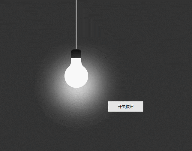
代码:
<!DOCTYPE html><html lang="en"><head><meta charset="UTF-8"><meta http-equiv="X-UA-Compatible" content="IE=edge"><meta name="viewport" content="width=device-width, initial-scale=1.0"><title>Document</title><style>/* :root全局css变量搭配var()函数使用 */:root {--light-color: #fff}* {margin: 0;padding: 0;box-sizing: border-box;}body {width: 100%;height: 100vh;}.container {width: 100%;height: 100%;display: flex;}.light-container {width: 100%;display: flex;justify-content: center;align-items: center;background-color: #333;}.light {position: absolute;width: 80px;height: 80px;border-radius: 50%;background-color: var(--light-color);transition: all 0.24s;}.light::before {content: '';position: absolute;width: 35px;height: 80px;border-radius: 10px;background: var(--light-color);left: 27.5%;top: -50px;border-top: 30px solid black;}.light span:nth-child(1) {position: absolute;width: 30px;height: 30px;background: transparent;box-shadow: 20px 20px 0 10px var(--light-color);border-bottom-right-radius: 40px;left: -4px;top: -16px;transform: rotate(342deg);}.light span:nth-child(2) {position: absolute;width: 30px;height: 30px;background: transparent;box-shadow: -20px 20px 0 10px var(--light-color);border-bottom-left-radius: 40px;right: -3.4px;top: -16px;transform: rotate(16deg);}.wire {width: 4px;height: 400px;background-color: #8f8e8e;top: -18%;position: absolute;transition: all 0.24s;}.light::after {position: absolute;content: '';width: 140px;height: 140px;background: var(--light-color);border-radius: 50%;top: 50%;left: 0;filter: blur(40px);transform: translate(-18%, -40px);box-shadow: 0 0 10px var(--light-color),0 0 30px var(--light-color),0 0 60px var(--light-color),0 0 120px var(--light-color),0 0 200px var(--light-color),;}button {position: absolute;bottom: 240px;right: 240px;width: 120px;height: 36px;}</style></head><body><div class="container"><div class="light-container"><div class="wire"></div><div class="light"><span></span><span></span></div></div></div><button>开关按钮</button><script>let switchOn = truelet btn = document.querySelector('button')let light = document.querySelector('.light')let wire = document.querySelector('.wire')btn.onclick = () => {switchOn = !switchOnif (switchOn) {document.documentElement.style.setProperty('--light-color', '#fff')wire.style.background = '#8f8e8e'document.styleSheets[0].addRule('.light::before', 'border-top: 30px solid #000');} else {document.documentElement.style.setProperty('--light-color', '#333')wire.style.background = '#333'document.styleSheets[0].addRule('.light::before', 'border-top: 30px solid #333');}}// 使用js动态给伪元素设置样式,参见文章:http://t.zoukankan.com/kunmomo-p-12358005.html// 另外样式表也是一个对象,也可以打印 document.querySelector('style') 可访问其上的css属性</script></body></html>
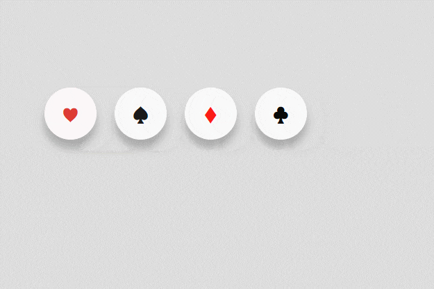
代码:
<!DOCTYPE html><html lang="en"><head><meta charset="UTF-8"><meta http-equiv="X-UA-Compatible" content="IE=edge"><meta name="viewport" content="width=device-width, initial-scale=1.0"><title>Document</title><style>body {padding: 180px;background-color: #ddd;}.item {box-sizing: border-box;display: inline-flex;align-items: center;height: 60px;/* 手风琴效果就是鼠标悬浮宽度过渡 */width: 60px;margin: 4px 8px;/* 超出隐藏,因为要把伪元素文字遮挡住 */overflow: hidden;background: #fff;border-radius: 30px;box-shadow: 0px 10px 10px rgba(0, 0, 0, 0.24);transition: all 0.5s;}.item:hover {width: 180px;border: none;}/* 悬浮加背景色 */.first:hover .icon {background-color: pink;}.second:hover .icon {background-color: #e9e9e9;}.third:hover .icon {background-color: pink;}.fouth:hover .icon {background-color: #e9e9e9;}.icon {width: 60px;height: 60px;display: flex;justify-content: center;align-items: center;border-radius: 30px;font-size: 28px;position: relative;transition: all 0.5s;/* 真实元素阻止鼠标事件,伪元素自动鼠标事件 */pointer-events: none;}/* 通过伪元素添加内容介绍文字 */.item:nth-child(1) .icon::after {position: absolute;content: '我是红桃';/* 宽度随着内容自适应 */width: fit-content;/* 文字不换行 */word-break: keep-all;/* 设置伪元素文字大小为中等大小 */font-size: medium;left: 72px;/* 真实元素阻止鼠标事件,伪元素自动鼠标事件 */pointer-events: auto;cursor: pointer;}.item:nth-child(2) .icon::after {position: absolute;content: '我是黑桃';width: fit-content;word-break: keep-all;font-size: medium;left: 72px;pointer-events: auto;cursor: pointer;}.item:nth-child(3) .icon::after {position: absolute;content: '我是方块';width: fit-content;word-break: keep-all;font-size: medium;left: 72px;pointer-events: auto;cursor: pointer;}.item:nth-child(4) .icon::after {position: absolute;content: '我是梅花';width: fit-content;word-break: keep-all;font-size: medium;left: 72px;pointer-events: auto;cursor: pointer;}/* 鼠标悬浮加文字下划线(给伪元素添加hover样式) */.icon:hover::after {text-decoration: underline;}</style></head><body><div class="item first"><div onclick="clickAfter('红桃')" style="color: #DD3B32;" class="icon">♥</div></div><div class="item second"><div onclick="clickAfter('黑桃')" style="color: #1A1A1A;" class="icon">♠</div></div><div class="item third"><div onclick="clickAfter('方块')" style="color: #FB1C17;" class="icon">♦</div></div><div class="item fouth"><div onclick="clickAfter('梅花')" style="color: #090B0A;" class="icon">♣</div></div><script>function clickAfter(who) {console.log(who);}</script></body></html>


发表评论